With the Sun on Our Right is now available for pre-order.
I recently asked for feedback on the draft cover designs for my book. I had an overwhelming response (over 200 people shared their view) and wanted to say thank you to everyone who contributed.
The most popular cover was this:

I think it’s symmetry and simplicity make it the most aesthetically pleasing of the four designs.
Two people on the cover
However, lots of people pointed out that since there were two of us on the trip, and the book’s title says ‘our’, the cover really should have two people on it. (Or, at least, not a close-up of me with a beard).
Given that the title isn’t about cycling, I think it is also important that the cover includes bikes, otherwise it’s not clear what the story’s about.
Unfortunately, we have very few photos that include both of us cycling. That’s for the obvious reason that any such photos required us erecting a tripod, setting a timer and riding past the camera.
(Some other people suggested that since the book is supposed to be about the people we met, the cover should be of other people and not us. Whilst I like the sentiment – and please see my finished product below- if I had a photo of an Iranian family or Thai policeman on the front cover, I think it would be a bit confusing).
Essentially, we have two decent photos, one of which I used to make this:

This design is pretty naff because I ran out of energy/time and made it really quickly. It was less popular than my other design, below, and since I am not a big fan of the photo, I wrote this one off.
That leaves one other design:

This was my favourite. I like the way it draws the eye, the warm ‘sunny’ feel and the symmetry. And I like the fact that it’s quite generic, the cyclists could be anyone.
Recommendations for improvement
The recommendations I received for it were varied and often in direct contradition of one another (e.g. ‘Design 1’s best but use the font from 4’ and ‘Design 4’s best but use the font from 1’). But some suggestions I tried included: moving the cyclists up, making the title bigger and clearer and removing some of the capitals.
That produced something like this:

Using a designer
I was pretty set on using this design but, alongside the feedback on my designs were a few voices saying that the designs were all a bit amateur and that I should get a designer to help me.
As someone who has paper for skin, my primary response to this was to sulk. However, as Laura pointed out, I am not a designer so there’s no reason to assume I would be any good at it.
Then, with wonderful timing, I received an email out of the blue from a designer by the name of Anne-Sophie Rodet offering her assistance.
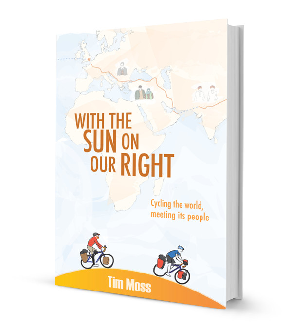
Over the last two weeks, she has been working tirelessly to design a cover that fits the feel of the book (it’s a warm and friendly book, not a tale of extreme cycling), features two cyclists and features drawings of actual people that we met on our travels.
Final cover design
So, with a final thank you to everyone who took the time to give me feedback and a huge thank you to Anne-Sophie for working so hard at short notice, I would like to present the finished cover for my new book:
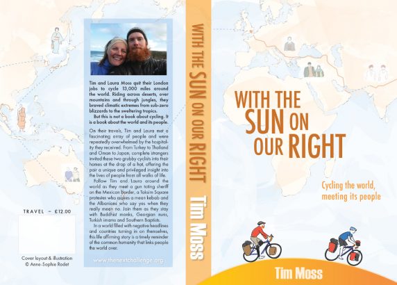
And here is the full design, front, back and spine (click to see a larger version). The only thing that might still change is the tagline and the blurb on the back:
Order a copy
With the Sun on Our Right is now available for pre-order.
What do you think? Please do add your thoughts below…