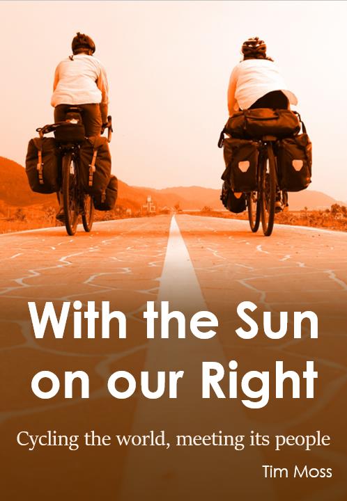
My book about about cycling around the world is almost finished.
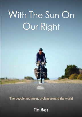
However, I still need to decide what goes on the cover, and that’s where you can help.
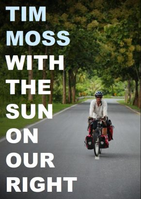
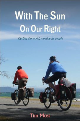
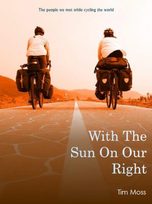
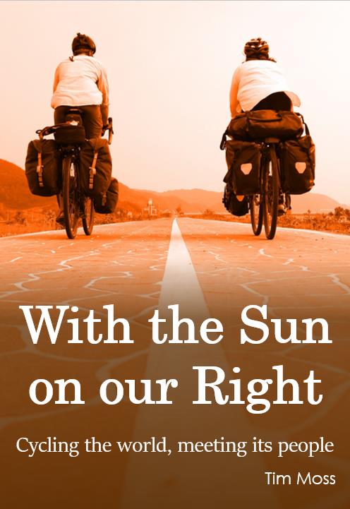
I’ve made a shortlist of four different designs and I would like you to vote for your favourite.
It’s hard for me to be objective because each of the photos holds so many memories for me. Plus, what I think looks good might not be what other people want to see on the cover of a book.
Below are four possible designs/concepts. They are just rough drafts – the photos still need some editing, the fonts and colours may change, and I still need to decide on a tag line – but hopefully you’ll have an instinctive response to the ideas.
Take a look and cast your vote…
The draft designs
Click the images to view full-screen.
Design 1
Design 2
Design 3
Design 4
Vote for your favourite
Choose your favourite on the form below and hit ‘Submit’. You’re welcome to add any other comments on the survey form or in the comments section at the bottom of the page.
If the form above doesn’t work for you, just add a comment below with your preferred design.
7 Comments
Andy Hayes
1, 3 and 4 are too cliched. Reduce the text size on number 2 and put it at the top.
Tim Moss
Cliched??
Jack
The last one has more balance in the design. I’d suggest printing it out, wrapping around a book and place next to other books and compare how it sits/reads.
The subtitle at top needs work, its floating. Try moving it down or enlarge.
Also the title may need some work. Try enlarging font or look at other font. Good luck
Tim Moss
Thanks Jack. I agree about the floating subtitle and need for a bigger font. Here are updated versions:
I like the idea of printing it out and wrapping it round a book. That may be this weekend’s activity…
Alice
The first has a nice clean but warm feel, but I like the idea of both of you in the frame, more accessible to female readers. Not such a fan of the big text on 2 but like the photo. If I had to choose two concepts, I’d go for either no 1 or no. 4. Lovely colours in both. (Sorry if that wasn’t helpful at all!)
Tim Moss
Thanks Alice. I think you’ve summarised the majority opinion: #1 is clean and visually appealing, but #4 has both of us in and fits the story better.
Andy
Hi.
I concur. 1 is a good photo and would be the best if Laura was in it too – I assume she may have been the photographer? Go with 4 but maybe play around with colour hue? Glad you haven’t gone too avant-garde and put a cake on the front! Cheers. Andy.